I went shopping!!! It was one of those days where I couldn't just pass by my local University Art Store... I had to go in and stock up. Good thing I had my shopping list on my phone. Earlier that week I received a package from DickBlick, so I decided to make my first ever Haul video. Hope you enjoy my excited chatter?
Links from this video (in no particular order)
Golden polymer medium
Golden Fluid acrylic in Zinc white
Prismacolor NuPastels
Tortillions
Gelly roll pen in White
Pentel Sunburst in White
Tesia Blackburn (Golden Artist)
Princeton brushes
Heart Clothing Boutique
Kneaded eraser
Derwent Watercolor pencil in flesh pink
If you ever have any questions about the products I use, or talk about, please don't hesitate to email me. Subscribe to my YouTube channel to be the first to view my videos (they usually are posted on the channel a couple days before the blog post is published). Thanks for watching!

Showing posts with label acrylic paints. Show all posts
Showing posts with label acrylic paints. Show all posts
Wednesday, February 16, 2011

Friday, February 4, 2011
Chloe...
 |
| ...just a glimpse of Chloe... |
I use a combination of Prismacolor Watercolor Pencils, and Derwent Watercolor pencils. I prefer Prismacolor, but I'm use specific Derwent colors... you can buy them individually, instead of paying for an entire set. I start with Prismacolor Sunburst yellow and then use Burnt Yellow Ochre, Pink Madder Lake, and Deep Vermillion (all Derwent colors)... in that order. The last color I use Prismacolor's Burnt Sienna, a dark brown with a reddish undertone. I reserve this color for shading the darkest areas, after I have blended out the first 4 colors with acrylic paint... more on that later. Working from your lightest color, to your darkest color, allows you to reshape your face and features as you go. You can also control varying amounts of shading that occur naturally on the face. Monica suggests working off a picture of a real face, and I agree this helps a great deal. There's no guessing, just draw and shade what you see. Here's my progression of shading, as I work through my five colors.
 |
| sunburst yellow |
 |
| Sunburst yellow & burnt ochre |
 |
| yellow, ochre, and pink madder lake |
 |
| yellow, ochre, pink madder, and deep vermillion |
 |
| ...let's start her hair... |
 |
| ...reshaping her Princess Leia buns with Terra Cotta... |
I like working on the Gessobord, it's textured surface is similar to what I'm used to, but alas... I miss my watercolor paper. It's making me think I should just draw my face on my favorite paper and glue it on using gel medium. Hmmmmm. Let's try out the Claybord, and then we'll attempt the other option. Another thing I noticed was the PVA glue acts as a resist, so the watercolor pencil doesn't transfer very well over the collaged areas... no bueno. I wonder if it would make a difference if I used gel medium, instead of PVA glue... or apply clear gesso over the collaged areas. Something to keep in mind.
I used a light hand with the watercolor pencils because I wanted Chloe to have fair skin. However, when I blended out the pencil with fluid white acrylic paint, her skin was a little to fair, for my taste. I will add some more color with flesh tone acrylics and terra cotta pencil on my future layers. Here's what she looks like now.
 |
| ...still needs a lot of shading... |
Like I mentioned before, the PVA glue acted as a resist, and I wasn't too happy with the results. Good thing I do multiple layers on my painting, even the hair... we will find a way to fix it!!
 |
| ...PVA glue acts as a resist... |
Let's talk about blending. I use the same color on the face and hair, but get different results when blending because I use white fluid acrylics to blend the face, and only water to blend the hair. The white paint "pastels" (not really an action word, but what the heck) the pigment of the color pencil pigment. You maintain the true pigment color of the pencil when you blend with water (or mineral spirits, whatever you prefer), so the terra cotta color I used makes a beautiful version of red hair. Here's a couple sample swatches I did in my sketch book. You can play around with the amount of color saturation by varying the amount of white paint you use.

Well, I hope this was helpful. Miss Chloe is not even close to being done, but my days off are upon us, so I plan to finish her up and show you my progress. Talk to you soon!!
Friday, January 28, 2011
First Stage of a layered background...
A follow-up to Wednesday's quick video... here are two videos that go through my process of starting my first couple layers of a painting. I decided to focus on Chloe, on Gessobord, but I will working with Delores, on the Claybord, over the next couple weeks. Next month's Cravings (scheduled for February 9th) will be about these two great Ampersand bord's, so stay tuned!! This background is by no means complete, and it may look completely different by the time the painting is complete, but it's how I start. Call it a "warm-up". Sometimes I hate my first couple layers. As I add and add on to them, that first "unwanted" layer leaves a beautiful underlying texture to all the others. Don't stress, just play!
I talk a little bit about mixing your own shade of Titan buff, so here is my formula (approximations... I don't measure): 10 parts Titanium White, 1 part Burnt Umber, and a couple small drops of Indian Yellow. I use mostly fluid body acrylics, but you can use whatever type you have available.
Links from the video
Golden Acrylics fluid and heavy body
If you ever have any questions about the products I use, or talk about, please don't hesitate to email me. Subscribe to my YouTube channel to be the first to view my videos (they usually are posted on the channel a couple days before the blog post is published). Thanks for watching!
Monday, January 24, 2011
Week 9... 2nd stage of a painting.
In this post I talked about the first stage of starting a new piece. Due to the fact that I fell out of love with my watercolor pencils, only to rediscover them in this class, I wanted to try out this new technique on a real piece. This meant I had to ditch my birch plywood and wood burning (briefly, just briefly), and try out Ampersand's bord's (yes... bord's, not board's... I don't know why). Today I'm trying the Clayboard and Gessobord with little Miss Chloe and Delores, my first of many paintings in the coming year.
Time to take off the training wheel of the sketchbook and put on my big girl britches. Hope you enjoy the video!
Links from the video
Prismacolor Watercolor pencil in sunburst yellow
If you ever have any questions about the products I use, or talk about, please don't hesitate to email me. Subscribe to my YouTube channel to be the first to view my videos (they usually are posted on the channel a couple days before the blog post is published). Thanks for watching!
Friday, January 21, 2011
Finishing my logo painting...
1. Finish PeachHoney logo painting... Completed January 10, 2011.
One of my favorite things to do is search on YouTube for for speed painting videos. I love to see how other artists start their paintings, and how they work through a piece to get their desired end result. I've had my logo painting sitting on my drafting table for awhile, staring at me as I work on other things. It was something I wanted to get done on my two weeks off work, so I decided it was time to clear my schedule and focus. Although I was almost finished with the painting, and you can't get a clear picture of my start-to-finish process, I wanted to give you a little taste. Hope you love it!!
PS... I'm starting my "Chloe" piece tomorrow and will be taping the entire process... start to finish. No talking, just painting. Maybe some music... hmmmmm. It will post on Monday!!!
Links from this video
Golden Heavy Body Acrylics in burnt umber, cad yellow, carbon black, and white
paper flowers
Golden Fluid acrylics in white and iridescent bright gold (fine)
Distress ink pad in Walnut stain
Wood burning tool with shading tip
Music by Roisin Murphy
If you ever have any questions about the products I use, or talk about, please don't hesitate to email me. Subscribe to my YouTube channel to be the first to view my videos (they usually are posted on the channel a couple days before the blog post is published). Thanks for watching!
Friday, January 14, 2011
How to stain with Golden Fluid Acrylics
Today I'm demonstrating how to stain your painting surfaces with Golden's Fluid Acrylic paint. I have to apologize in advance for the unwanted editing... I had to comply with the YouTube 10min time limit. I walk you through staining canvas, molding and crackle paste prepped with water and matte gel medium. Want to see the difference?


Links from this video
If you ever have any questions about the products I use, or talk about, please don't hesitate to email me. Subscribe to my YouTube channel to be the first to view my videos (they usually are posted on the channel a couple days before the blog post is published). Thanks for watching!
Wednesday, January 12, 2011
Cravings... Golden Fluid Acrylics
We have come to our second installment of my Cravings, and today we're talking about Golden Fluid Acrylics, with a little clarification on this video. Golden has so many great products and we are just scratching the surface of what they have to offer. Come back Friday for a tutorial on this great product.
If you ever have any questions about the products I use, or talk about, please don't hesitate to email me. Subscribe to my YouTube channel to be the first to view my videos (they usually are posted on the channel a couple days before the blog post is published). Thanks for watching!
Friday, December 10, 2010
How to blend heavy body acrylics...
Here is the painting from the video...

...and here is another version on a gesso primed piece of birch plywood...

VIDEO LINKS
8x10 Utrecht Cavas Board
Heavy Body Acrylics in Cadmium Yellow Medium Hue and Dioxazine Purple
Retarder
Acrylic Glazing liquid
Wednesday, December 8, 2010
Cravings... Golden Heavy Body Acrylics
I forgot to mention, if you want a more oil-like paint try Golden's OPEN paint line. I like the versatility I get with using the Retarder with the regular Heavy Body Paints, but to each his own. Here are the links to the products used in the video.
GOLDEN PRODUCTS
Heavy Body Acrylics
Retarder
Acrylic Glazing liquid
Monday, December 6, 2010
Week 2... Prepping a painting
Yea, I was rambling a little bit today, but I hope it was helpful. I can't wait until you guys see my next few cravings posts. I hope you swoon over my goodies like I do. I can't tell you how much these video are helping my creativity... I get to play while talking to all of you. It's so wonderful!!
Here are some links to the products I talk about it the video...
Painting Surfaces
Birch Plywood
Stretched Canvas
Ampersand Gessobord
Golden Gesso
Mediums
Winsor & Newton Watercolors
Golden Heavy Body Acrylics
Golden Fluid Acrylics
Portfolio Water Soluble Oil Pastels
Prismacolor Watercolor Colored Pencils
Ranger Adirondak Color Wash
Ranger Archival Ink
Ranger Distress Ink
ps... I made a little mistake... the mulberry color underneath the cerulean oil pastel was a watercolor pencil, not an oil pastel.
Saturday, October 16, 2010
The logo...
I'm nesting... organizing closets and the kitchen pantry, making placements to coordinate with the drapes. I haven't tackled the studio yet... that's a big job... one that takes concentration and more than the 30 minutes I have before work.

Even though I haven't started on the studio, I did clear the drafting table to start my logo. I felt an extreme desire to paint and I needed to address it before I went completely insane. I can't tell u how great it felt to pick up a paint brush... the inspiration came flooding back to me. Simply exhilarating.
I remember painting penguins in preschool and showing it off to my mom because, in my head, it looked exactly like a penguin. I felt the same way when I started painting my logo... proud of my gift and excited about what I could turn it into to. It feels good to be proud of something. Here's the beginning of the logo... I still have to add a little spice and sassiness, but it's definitely a strong start.

I'm still working on my color combos... I want the "brand" to be perfect, and I want it to be me, so I'm on the hunt for the perfect coordinating combo. Any suggestions?

Even though I haven't started on the studio, I did clear the drafting table to start my logo. I felt an extreme desire to paint and I needed to address it before I went completely insane. I can't tell u how great it felt to pick up a paint brush... the inspiration came flooding back to me. Simply exhilarating.
I remember painting penguins in preschool and showing it off to my mom because, in my head, it looked exactly like a penguin. I felt the same way when I started painting my logo... proud of my gift and excited about what I could turn it into to. It feels good to be proud of something. Here's the beginning of the logo... I still have to add a little spice and sassiness, but it's definitely a strong start.

I'm still working on my color combos... I want the "brand" to be perfect, and I want it to be me, so I'm on the hunt for the perfect coordinating combo. Any suggestions?
Saturday, July 12, 2008
Abstract Acrylic Class
I took another one of David Lobenberg's acrylic classes... and this one was all about abstracts... I love abstracts mainly because it gives me the right to PLAY!!!... Throw down some paint... and more... and more... and the best part is that if you don't like it you can wait until it dries and paint right over it... no waiting hours for the paint to dry...


For the bigger piece I put down a background of a tinted Yellow Ochre, and highlighted with a little gold metallic paint (love the metallic... it gives a little something in the right light)... David had a lot of circle's in his piece, and I loved it, so I took the plunger he brought to class, and per his instructions, dipped it in paint and started stamping...
One of the other reasons I love the class atmosphere is the plethora of products other students bring (especially to an abstract class)... Everyone feels like a kid in a candy story picking through an endless supply of play things... I borrowed another students Color Wash by Ranger and spritzed here and there...
After the entire background dried (only 15 minutes or so... love that!!) I used blue painters tape to mask off the area outside my silhouette painted the silhouette that lovely khaki green color, stamped the circle in the wet paint, and highlighted with some more gold and pearl paints... after that layer dried, peel off and reveal!!! Here's the semi-finished product... I still have some "texturing" to do (it's a little to flat to me)... I love the depth that peaks and valleys give to a piece... more to come... I promise to post the finished piece...

We did a couple pieces, one of which I'm completely in love with (and the other I don't like at all, and because of the beauty of acrylics I will paint right over it and start again... and all I'm left with is the wonderful bumps left over from the paining underneath... yummy!!!)... I did a journal entry of a silhouette modeled after this advertisement for house paint I found in a magazine... here is the ad...
...and here is the journal entry using oil pastels... I wanted to keep it simple because I knew I would eventually turn it into a bigger piece... and I did...
For the bigger piece I put down a background of a tinted Yellow Ochre, and highlighted with a little gold metallic paint (love the metallic... it gives a little something in the right light)... David had a lot of circle's in his piece, and I loved it, so I took the plunger he brought to class, and per his instructions, dipped it in paint and started stamping...
One of the other reasons I love the class atmosphere is the plethora of products other students bring (especially to an abstract class)... Everyone feels like a kid in a candy story picking through an endless supply of play things... I borrowed another students Color Wash by Ranger and spritzed here and there...
After the entire background dried (only 15 minutes or so... love that!!) I used blue painters tape to mask off the area outside my silhouette painted the silhouette that lovely khaki green color, stamped the circle in the wet paint, and highlighted with some more gold and pearl paints... after that layer dried, peel off and reveal!!! Here's the semi-finished product... I still have some "texturing" to do (it's a little to flat to me)... I love the depth that peaks and valleys give to a piece... more to come... I promise to post the finished piece...
Sunday, June 29, 2008
My Process... Practice makes perfect
Ok, so after my few days of overtime mayhem, I felt like I needed a release and when I got home last night I had a sudden urge to play... so I painted... Like I have said before my art journal is a place I allow myself to make ugly bad art (well I guess not-so-perfect-art is more like it)... My process has become a way to have fun, but also document tips and tricks I learn along the way... Here we go...
I usually start with a need to try something out... for this journal entry I wanted to try upgrading a rubber stamp by painting it with acrylic paint... a very simple idea, something I could expand on in never ending ways... This is the stamp I chose... I loved the simple and whimsical lines...

Next I mixed some paints until I got a background color I liked... I let it dry and then I mixed a darker color to glaze on the edges of the page... I will usually thin a glaze color with a little water to make it more transparent, but since I'm doing this on a journal page, and I didn't want the pages to wrinkle, I just wrapped a baby wipe around my finger and dipped it in a the glaze color and ran it along the edges of the page... (I later went back and did the same with the "pearlescent" color... a little bling)... And because I can't stand to have empty spots on my page I did a little laying down of color with my oil pastels... it looks messy, but I love it...
I usually start with a need to try something out... for this journal entry I wanted to try upgrading a rubber stamp by painting it with acrylic paint... a very simple idea, something I could expand on in never ending ways... This is the stamp I chose... I loved the simple and whimsical lines...
Next I mixed some paints until I got a background color I liked... I let it dry and then I mixed a darker color to glaze on the edges of the page... I will usually thin a glaze color with a little water to make it more transparent, but since I'm doing this on a journal page, and I didn't want the pages to wrinkle, I just wrapped a baby wipe around my finger and dipped it in a the glaze color and ran it along the edges of the page... (I later went back and did the same with the "pearlescent" color... a little bling)... And because I can't stand to have empty spots on my page I did a little laying down of color with my oil pastels... it looks messy, but I love it...
 I don't buy a ton of different acrylic paint colors (The Golden brand is a little pricey but glides like butter), and since I tend to mix my own custom colors I like to keep a journal of the colors I've mixed and what I used to get them... This is the page I did for this journal entry...
  On the opposite page I write little notes on tips and tricks I've discovered... for example, I discovered that my #2 Round brush worked well for precision coverage, but not detailing around the edges of the stamp... my small angled brush was better for the outlining and echoed that same delicate whimsical looked I loved from the beginning.. also, I found it was easier to blend when I applied my acrylic glaze directly to the area I was working on...
 I encourage all of you to PLAY!!!... by the way... I have my color theory class with my Mati tomorrow, so stay tuned for another little lesson...
Sunday, June 15, 2008
First Acrylic Painting Class
So I had my first acrylic Painting class Saturday morning at the local art store with David Lobenberg (check out his work on http://www.davidlobenberg.com/)...
I have to say that I was a little intimidated when I walked into the class and everyone was comfy cosy with their well-worn supplies... their stay-wet pallets were covered with paints and such from previous projects, whereas mine was perfectly white (because I bought mine that day along with everything else on the supplies list)... I asked the woman sitting next to me if she had painted before, of course she had, and when the teacher was giving a little intro into the wonderful world of acrylic paint (complete with industry lingo) everyone else seemed to follow right along, except of course for me...
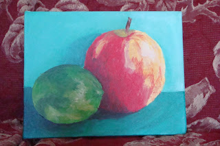
I spoke to David a couple weeks before the class to make sure that I didn't need any previous experience to follow along in the class, and he assured me that I didn't... my previous paint experience only included touching up little details here and there on my scrapbook pages and using it with my foam stamps... needless to say I was a little terrified when he set a still-life picture of an apple and lime in front of us... OH MY GOD!!! There's no freakin' way I was going to be able to do this... I was certain that my final piece would be the worst in the class...
I decided to just take it one step at a time and tried not to look at every one's perfect paintings... Well, when I was done with the apple I set it on a nearby easel to rest my eyes a little and stepped back to view my work... i was pleasantly surprised when one of the women came up to me and said, "Your apple is beautiful"... well, if the experienced painter thought my apple was beautiful, who was I to argue... anyway, here is the finished product (with he reference photo on the right)... I guess I have no reason to be scared of still-life paintings anymore...
I'm thinking about making a frame out of lattice wood pieces, a little tip from miss Claudine Hellmuth, and I can't decide which color to paint it... I've narrowed the choices down to classic black or yellow... whatcha think?

I have to say that I was a little intimidated when I walked into the class and everyone was comfy cosy with their well-worn supplies... their stay-wet pallets were covered with paints and such from previous projects, whereas mine was perfectly white (because I bought mine that day along with everything else on the supplies list)... I asked the woman sitting next to me if she had painted before, of course she had, and when the teacher was giving a little intro into the wonderful world of acrylic paint (complete with industry lingo) everyone else seemed to follow right along, except of course for me...
I spoke to David a couple weeks before the class to make sure that I didn't need any previous experience to follow along in the class, and he assured me that I didn't... my previous paint experience only included touching up little details here and there on my scrapbook pages and using it with my foam stamps... needless to say I was a little terrified when he set a still-life picture of an apple and lime in front of us... OH MY GOD!!! There's no freakin' way I was going to be able to do this... I was certain that my final piece would be the worst in the class...
I decided to just take it one step at a time and tried not to look at every one's perfect paintings... Well, when I was done with the apple I set it on a nearby easel to rest my eyes a little and stepped back to view my work... i was pleasantly surprised when one of the women came up to me and said, "Your apple is beautiful"... well, if the experienced painter thought my apple was beautiful, who was I to argue... anyway, here is the finished product (with he reference photo on the right)... I guess I have no reason to be scared of still-life paintings anymore...
I'm thinking about making a frame out of lattice wood pieces, a little tip from miss Claudine Hellmuth, and I can't decide which color to paint it... I've narrowed the choices down to classic black or yellow... whatcha think?
Subscribe to:
Posts (Atom)
LinkWithin
